I’ve noticed that people use Kinopio in two broadly different ways,
- More introverted: for personal thinking, organization, and research. Creating spaces with connected ideas primarily for your own understanding
- More extroverted: to share cool new ideas and stuff you like. Creating spaces with aesthetic layouts, backgrounds and colors for other people to enjoy
Social-ness isn’t a boolean or linear thing though. Everyone has introverted and extroverted qualities and use-cases, so I think it’s really cool that Kinopio is helpful across the spectrum.
But this also creates split priorities,
Some people want more Roam-y features that are better for deep-work and deep-thinking. Other people want more Figma-esque features that make their spaces more customizable and cooler looking.
Expanding on my last blog post about How I Build, sometimes I have to take a step back and ask myself “what feels like the ‘Kinopio’ thing to do”? What are the things that other tools can't do, or aren’t designed to do well?
It's a longer path to walk, but I think there's still room in the world for new interactions that are meaningful and memorable.

What's New
- Card Styles lets you toggle formatting for one or many cards at once
- Card Colors to personalize your spaces, group related cards, or set a vibe
- Hold to Pan on Desktop and Right click to Pan to more around space
- Selection Indicators help distinguish colored cards from cards selected by collaborators
- Split Cards Indent Pasting text indented with tabs or double-spaces (e.g. from an outliner) into a card and splitting it, creates child cards with indented positions
- Export All Spaces You could always export your spaces, but now it's you can export them all at the same time
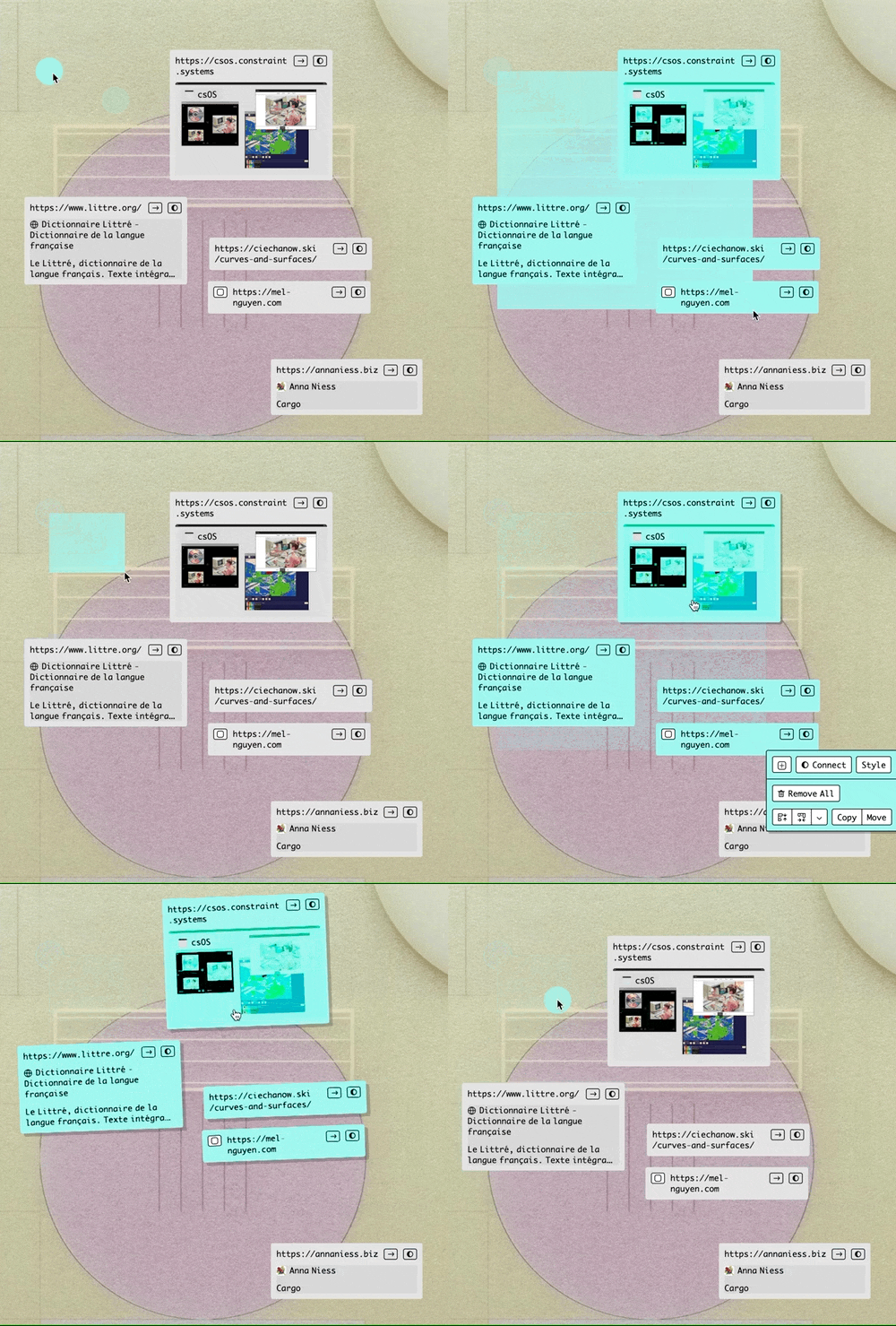
- Box Select Hold shift and drag to box select cards – especially handy when selecting large groups of cards


Upcoming
It's still winter outside, but inside Kinopio I think it's time for spring cleaning and bug fixing


