When the name of a card or box contains a headline, the fonts button will appear, allowing you to find the right font for your
AESTHETIC
I've been collecting fonts over the last year. But there was a lot of trial and error needed to find the ones that worked well together, and could set an atmosphere while still being flexible enough to cover every use-case.
These aren't the standard google/adobe fonts that you'll find everywhere else – each one is special in it's own way:
Apris
Foundry: Schick Toikka, Berlin, Germany
Funky, energetic, channeling the spirit of 1970s design, Apris has a real "let's go!" kind of energy.
Gaya
Foundry: Writtenshape, Paris, France
Wavy, soft, and inviting, if you were writing with a pen filled with honey you might end up with something as sweet as Gaya.
GroteskRemix
Foundry: bb-bureau, Paris, France
Not gonna lie, I discovered this font from the end credits of Mr. and Mrs. Smith on amazon. GroteskRemix is unlike anything else, but in the right contexts, especially on dark backgrounds, it can be really sophisticated and technical.
(p.s. don't sleep on the ## h2 variant of GroteskRemix)
GT America
Foundry: Grilli Type, Lucerne, Switzerland
I also wanted to provide a modern, professional sans-serif font that's ideal for use in serious planning and work spaces. It's authoritative without being authoritarian – a surprisingly fine line in the world of fonts.
Microgramma
Foundry: URW Type Foundry, Turin, Italy
Technical, space-age, utopic – microgramma is from a past where people were optimistic about the potential of new technology to improve our lives, like microchips and microwaves. If you're trying to make a better world, it's a fun place to start.
Migra
Foundry: Pangram Pangram
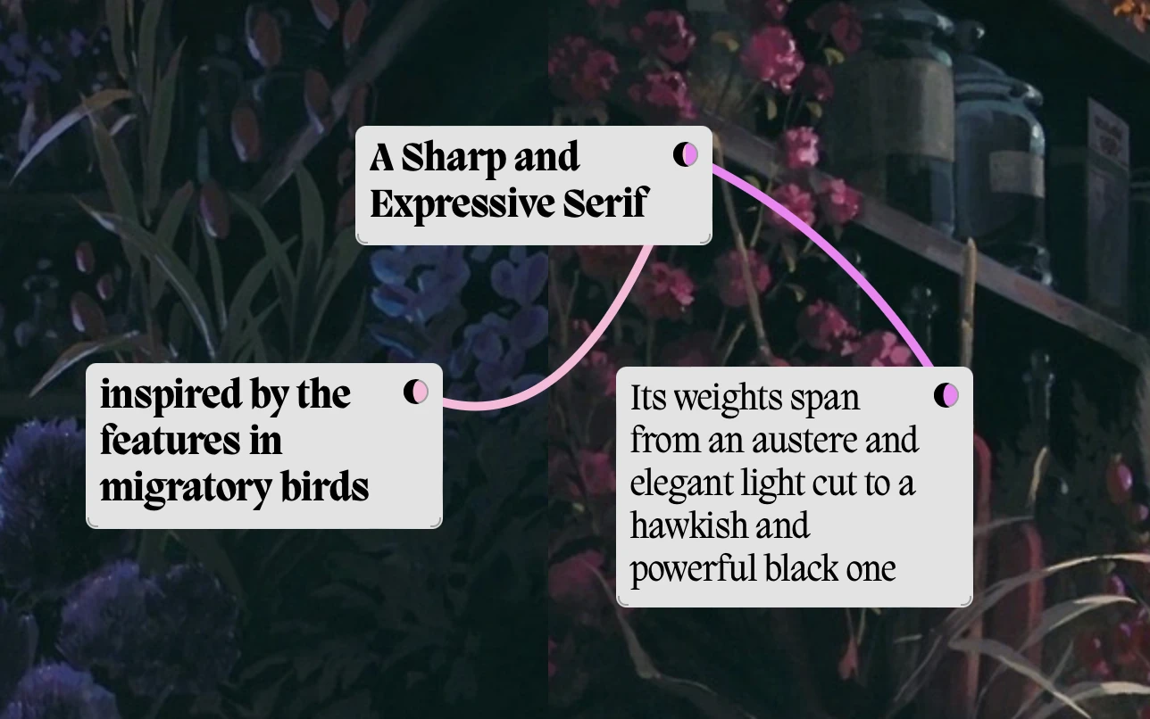
Migra has brush-like edges like the kind you'd find in ornate monastic texts – but because those edges are also geometric, it works well in modern spaces too.
Recoleta
Foundry: Latinotype, Chile, Peru
This is the previous/current default header font so it's probably the most familiar. It's still a great choice that really shines in personal spaces.
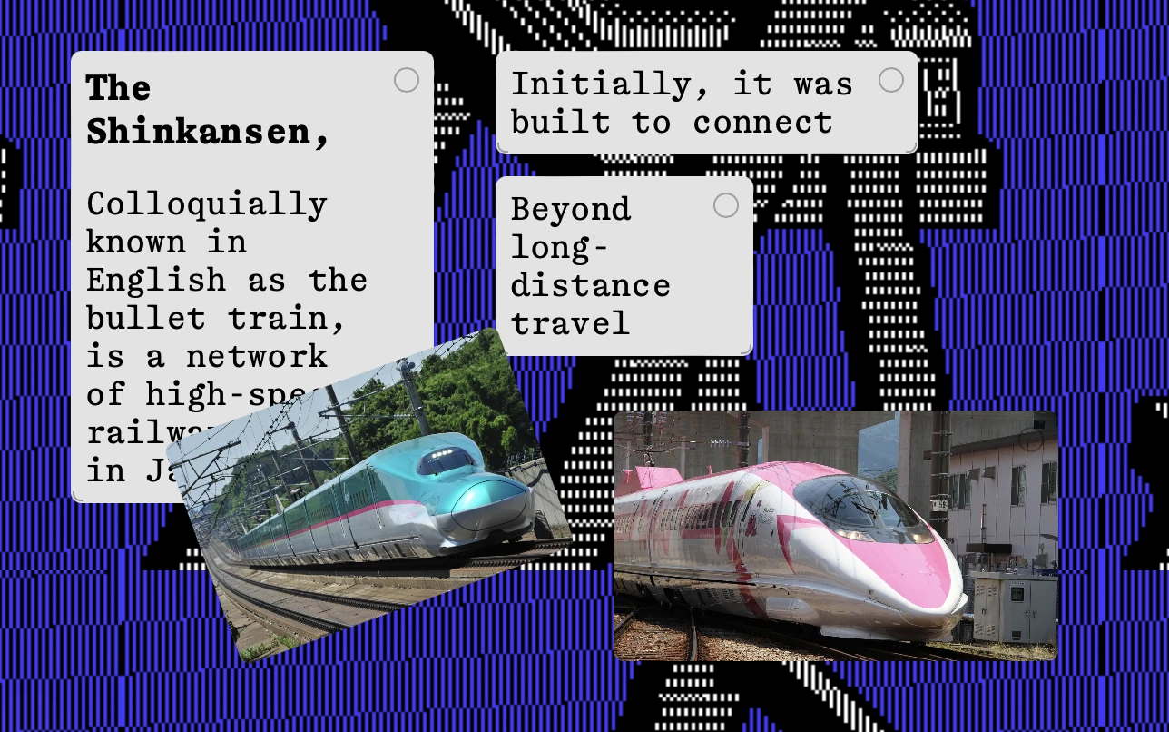
Shinka-Mono
Foundry: Aeiou Tools, Passenans, France
Originally, Kinopio used a version of Osaka-Mono that I hand-customized to work better with english punctuation as it's only font. But I eventually let it go so the app would work better for people in Asia and other non-latin countries. Shinka-Mono, designed to look like the english glyphs in Japanese fonts, is reminiscent of those experimental days.
Monospace fonts aren't just for programmers, they're for every creator.